FROM THE FRUIT OF THE GODS
Client
Cosmo Cocoa
Industry
Consumer Beverage
Project
Packaging Design for Retail
Expertise
Packaging Design
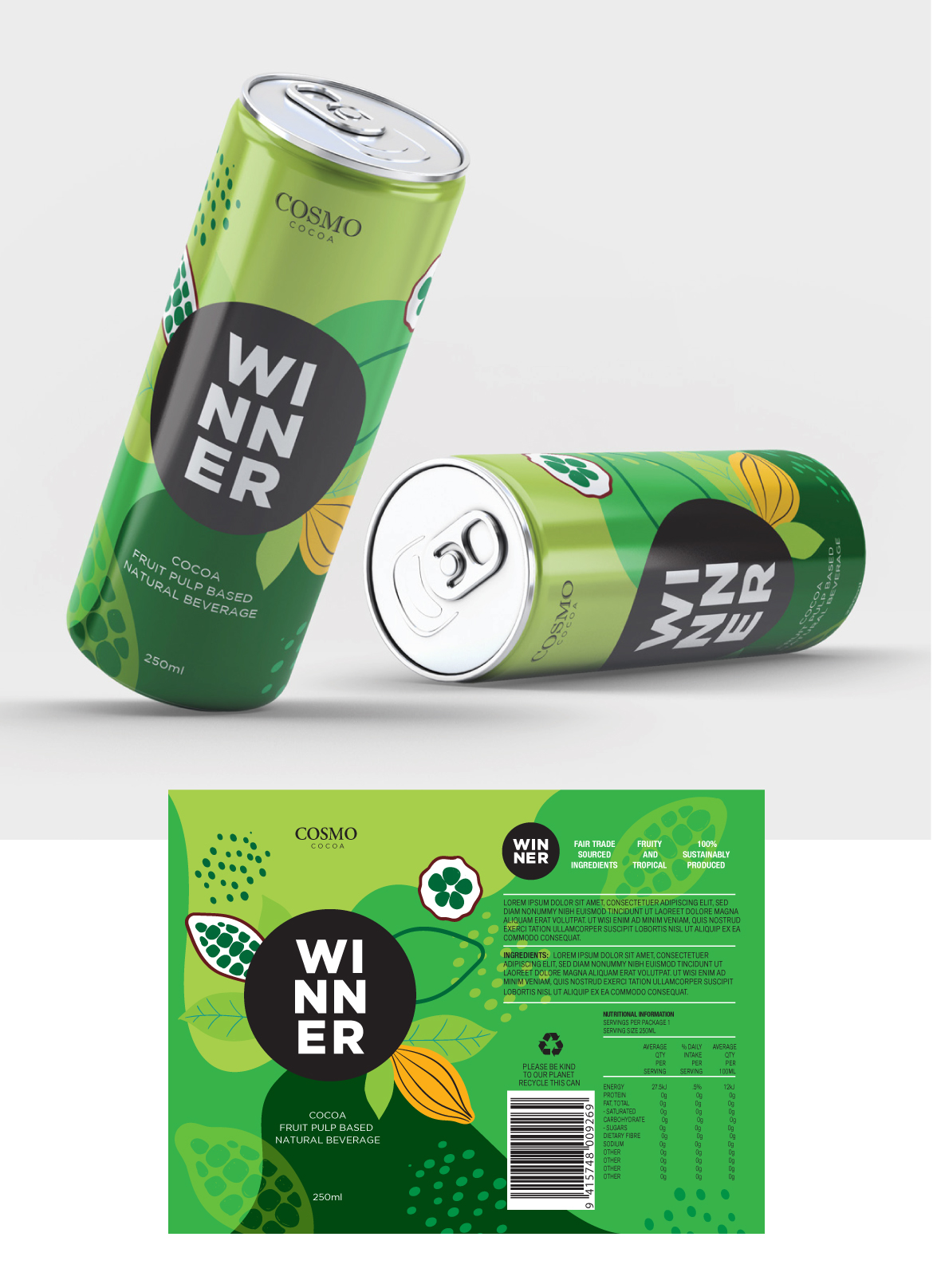
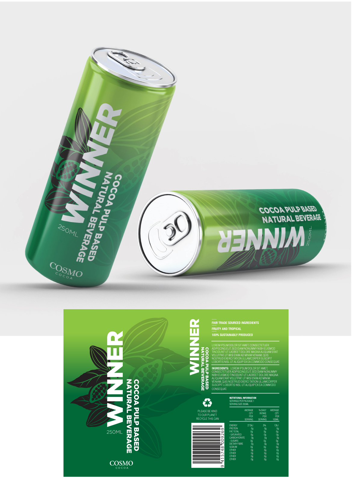
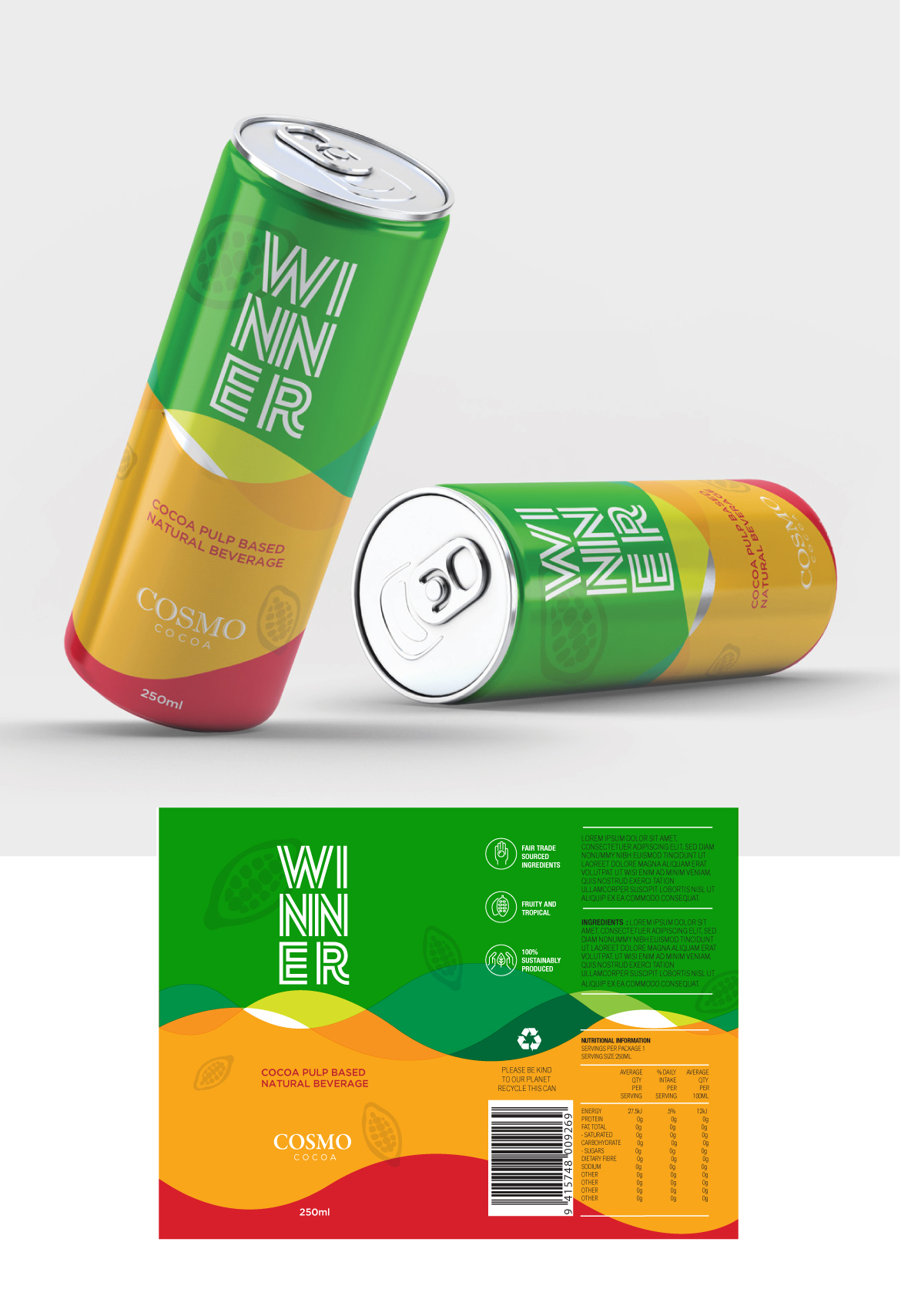
Cosmo Cocoa was developing an innovative new beverage that transformed by-products from chocolate production into the basis of a healthier, naturally derived energy drink. RedSpark Creative was asked to explore the packaging direction for the new product, developing a range of concepts for the beverage cans.
The challenge was to create a visual identity for a product that sits at the intersection of wellness, energy and sustainability, while establishing a strong connection to its origins in the cocoa plant. We explored several creative directions, considering how colour, typography, imagery and graphic elements could communicate the natural origins of the product while still giving it the energy and shelf impact expected of a contemporary beverage brand.
The concepts were designed to stand out in a competitive drinks market while avoiding the overly aggressive visual language often associated with traditional energy drinks. Instead, the directions explored a more sophisticated and health-conscious aesthetic that could appeal to consumers looking for something different.
Although these were concept designs rather than a final production range, the project provided Cosmo Cocoa with a selection of distinctive packaging directions to help shape the visual future of this innovative new beverage.